
“In most people’s vocabularies, design means veneer. It’s interior decorating. It’s the fabric of the curtains and the sofa. But to me, nothing could be further from the meaning of design. Design is the fundamental soul of a man-made creation that ends up expressing itself in successive outer layers of the product or service.”
Steve Jobs
Design is more than how a product looks. It’s how it works. More specifically, it’s about solving problems by shaping all the points of contact, both physical and cognitive, that a user has with a product.
Our design process divides the task of product design into three stages: Conceptual Design, Interaction Design, and Interface Design.
- Conceptual Design:
- What does it do?
- Interaction Design:
- How does it do it?
- Interface Design:
- What is its look and feel?
Early in the design cycle, conceptual design is critical. Later, after the product’s feature set jells, interaction and interface design predominate.
Often, product designers juggle all three aspects of the design at the same time—you can’t produce a good interface design if the interaction design is lousy; and it is very difficult to create a quality interaction design without having a good understanding of the function and goal of the product. We find that separating these steps into consecutive stages makes for better products and a more efficient development process.
An ATM Machine helps to illustrate our design process.
Conceptual Design
Conceptual design focuses on what a product does. We start by identifying the business goals and the constraints. Then we focus on the users and visualize what they want from a particular product. We identify the goals and expectations of each type of user under the circumstances of how they will use the product, and then seek ways of satisfying those goals and shaping those expectations. Rather than driving this process by what the technology offers, we prefer a “user experience” approach to determine a product’s feature set, always mindful of the needs of the business.
As an example, consider the creation of a bank ATM. Conceptually, an ATM needs to allow an ordinary person to do some common banking functions: deposit and withdraw money from multiple accounts, transfer funds between accounts, and receive information on check balances and recent transactions. Because money and personal information is involved, security is critical. ATM security can be divided into bank security and customer security. Customer security can be further divided into data security and physical security. During the conceptual design phase, there would be a recognition of the desirability of helping to prevent attacks on customers standing outside on the street with their data and money potentially vulnerable.
Designs must respect constraints, usually involving money, time, and resources. For example, on the customer security issue, it may be desirable but impracticable to provide a security guard at each ATM. A lot of impracticable ideas fail to survive the conceptual design phase.
So the conceptual design specification for an ATM would list all of the desirable functions that the machine would do to meet the needs and goals of its users and the bank.
Interaction Design
touchscreen
keypad
physical input/output
An ATM usually presents three main interaction areas to a user.
Interaction design focuses on how a product behaves. It touches all the points of contact between a product and the user. As such, it unlocks the functionality of a product. Information architecture is part of interaction design. For example, during the interaction design phase of a website, the designer might, among other things, determine how the webpage would organize the content.
A list of features were created during the conceptual design of the ATM. During the interaction design phase, the designers figure out the best way to implement those features. Designers might decide that there are three focal points to this device: a touch screen which allows input and provides visual feedback; a keypad that allows the user to enter information; and the physical input/output devices which handle the insertion of the bank card, the acceptance of a deposit, and the delivery of the currency and a receipt. It would be important to determine how big to make the “hot spots” on the touch screen, how the screen should be angled to reduce glare, which information should be entered on the keypad and which via a touch screen, how many levels deep to make the hierarchy of information presented to the user, and so on.
Responding to the ATM customer security issue raised during the conceptual design phase, for example, the interaction designer may specify site lighting, television cameras, screens viewable from only a narrow angle, privacy panels, reflective surfaces to allow users to see what’s going on behind them, alarm buttons, limits on withdrawals, and so forth.
The list of all interaction design criteria is very long even for a relatively simple product. The implementation of interaction design specifications happens during the interface design phase.
Interface Design
Interface design focuses on how the product looks and feels. Often the problems of look and feel are mistakenly thought to be the entire design problem. But look and feel is only successful if the other design issues have been carefully crafted first.
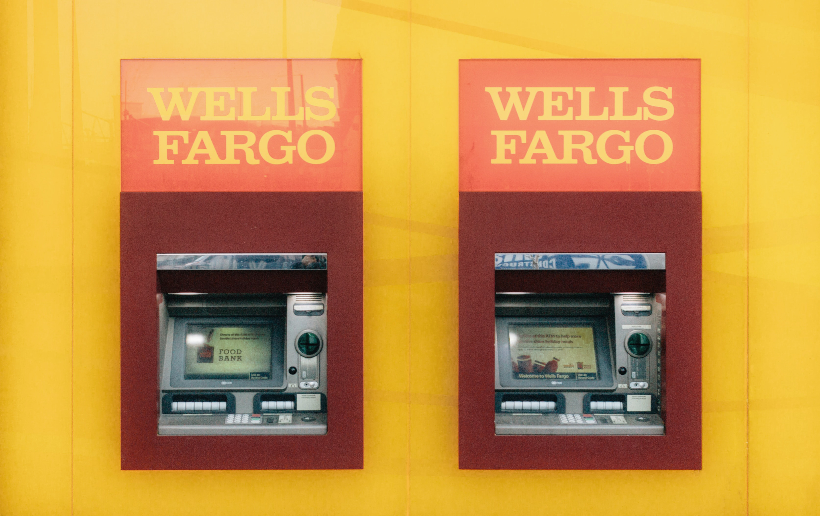
For the ATM, interface design includes the materials out of which to make the keypad, the way the information is presented on the screen, and how user feedback is implemented for each action the user makes. It includes the graphics and instructions that surround the monitor and buttons. Recently, Wells Fargo replaced its ATMs with a newer touch screen model. While similar to the old, the new ATM model differentiated between the beep sounds the keypad made and the beep sounds of the touch screen. So if a person wanted to withdraw a standard amount, the beeps revealed only that she was pressing the touch screen (one beep per standard amount). But if the user wanted something different, she would have to use the keypad, and the sound of the beeps revealed what she was doing—five beeps meant that the withdrawal was $100 or more. The physical security of the customer is potentially jeopardized by the sounds of the beeps. This is an example of a flaw in the interface design stage.
Wells Fargo’s ATM designers must have noticed that many customers do the same ATM transactions over and over again. So they added a feature—some of their ATMs now remember the last transaction done by a customer and present it the next time as a one-touch option. This design addition makes specifying that transaction much easier for the user and alleviates the security concern with the audible buttons.
User-Focused Design
The first and last thought of product designers should always be the needs of the user. A person uses a product to achieve a goal. The design of a product can either help or it can form obstacles that interfere with the realization of that goal. A product created to meet the goals of its users is easier to use.
Designers who consider those needs produce far more effective products than those who base their designs on aesthetics alone. The difference between a product that helps or hinders a user is rarely the difference between pretty buttons and ugly ones. While there’s an aesthetic component to well-designed products, the design of a product is about more than how it looks.
A well-designed product should be entirely understandable by its users. It should allow users to easily find the product’s functionality. An intuitive product allows the user to correctly guess both the existence and the location of functions. Features that users don’t understand won’t be used.
Sometimes it is not possible to design in such a way that users entirely understand the product. Then there should be cognitive scaffolds which allow the product’s functionality to unfold to the user, with advanced functions becoming clear as the user needs them.
A good product requires a foundation of good design. Effective interface design builds upon well-considered interaction design. Constructive interaction design is built upon realistic conceptual design. Thoughtful conceptual design is built upon a thorough discovery of the goals of the business and the needs of the users.
Can You Skip Design?
Perhaps some of it—if it’s already been done for you. If you need a website and have a canned template in hand that matches the goals of your business and the needs of your users, then perhaps you don’t need to go through a design process.
Some clients just want to get something up, design be damned. Web builder sites like SquareSpace or Wix offer many templates that promise to solve the communications problems of their clients. Just paste in some content and press go.
We’re suspicious of how this actually works in practice. Design is about much more than how something looks. It’s about solving problems. And the pre-written template approach rarely does that. Even starting with a template created for your industry, there are still design issues that need to be solved.
Imagine you’re a photographer. You’re building a website and have a portfolio of images. You see a beautiful template created just for photographers—it displays images attractively and allows users to interact with your shots on desktops and mobile phones. Are you done with design? Hardly.
Consider your goals for this photography website:
- Do you take assignments? Do you want editorial or commercial or nature or sports or wedding gigs or fashion shows?
- Do you want to sell prints? Do you license your images or accept buyouts? Do you offer single images or albums?
- Do you have a studio? Would a client feel safe going there?
- Do you worry about images being pilfered from your website?
- Do you tell a story with your photographs? Do you want to tell stories about your photographs?
- Do you want to teach photography?
- Do you want your users to react emotionally to your images, or examine them as art, or be impressed with your technical acumen, or Photoshop skills, or amazing timing?
- Do you present yourself as expensive or inexpensive? Do you want to be seen as aloof or accessible?
- Do you use artificial lighting or natural light? Do you use a lot of gear or do you travel light?
- Do you communicate what it would be like to work with you? What do you communicate about what you’re like as a person?
None of these questions will be answered by the template. And that’s just the beginning of a thoughtful exploration of what the website needs to communicate. All that—and much more—should be part of the website. A template geared for a photographer doesn’t capture the communication needs of the photographer. Even with an attractive and functional template, there’s still design to be done.
Other Resources from Pipsqueak
Some questions we ask during project design are informed by the science of cognition. How do people solve problems on a computer? What mistakes do they commonly make and why? What can technology do to assist them? For more on this, please take a look at our Interface Philosophy page on this site. Or read our book or blog on this subject, shown in the boxes below. Or contact us. We’d love to help.