Graphic design needs two attributes: one is artistic inspiration and execution, the other is problem solving. Both are necessary to create effective graphics. Without the first, you get functional but pedestrian work—plain, lifeless, dull. Without the second, you get pretty imagery that doesn’t address the problem. Without either, you get nothing.
I’m Glad to Meet Ya!
Whatever your transportation needs, a used car salesman tries to solve them with a vehicle from his lot.
Some web design shops want to sell you what they have on hand. They’ve made a cookie cutter and want to start cutting cookies—a couple of modifications, slap your logo on top, and it’s out the door. But have they addressed your business goals?
We focus on our clients’ goals. What do they need? What audience are they trying to reach? How can we advance their business? In addition to goals, all projects have constraints; we fashion solutions accordingly. Since each project has different goals and constraints, each solution is unique. We think of that as craftsmanship.
Graphic Creation
At Pipsqueak, we’re software polymaths. We incorporate the best that each has to offer when creating the assets for our projects. While we use many software tools, our work doesn’t always originate in the computer. We’re not averse to physically making marks on canvas or paper to get the effects we seek. Olga is an accomplished painter with work housed in the permanent collection of the Hermitage Museum in St. Petersburg. (Christopher can’t draw worth a damn.)
Software tools don’t solve design problems; Photoshop’s twirl filter is an effect, but rarely a solution. The tools make it easy to create something, but not the right thing.
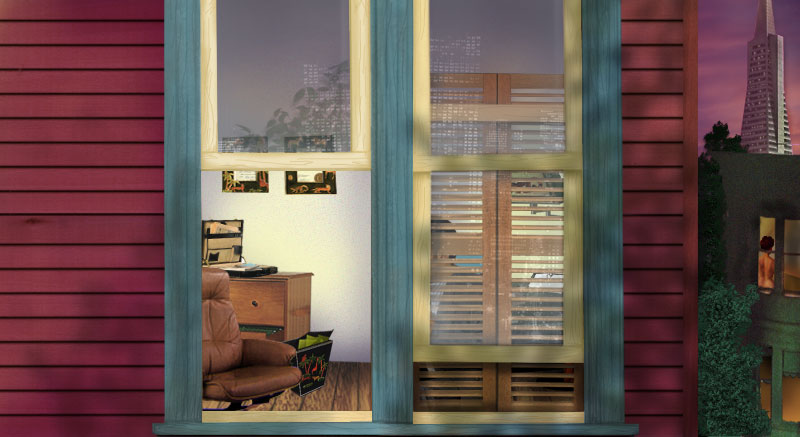

This was the stage for a voyeuristic web show focused on the open window.
An animation shows the various layers used to create this image.
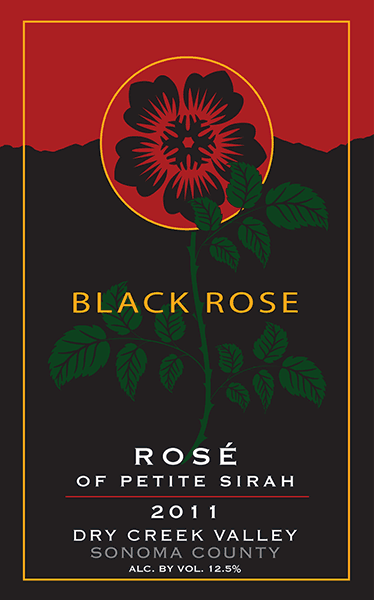
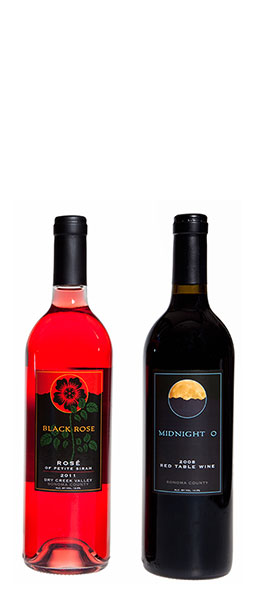
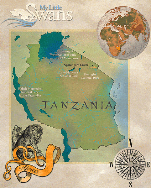

Vector Illustration Assortment
of Computer Networking Products (press or hover to enlarge)
Logo Creation
A logo is a graphic challenge: create a single image to represent the soul of a company. Good logos arise through a collaboration between creator and company. It can be thrilling to watch a concept or a feeling take visual form. A logo often serves as the graphic seed for content created later, influencing the look of the website and collateral materials.
There’s a technical side to logos as well. Logos need to work in a variety of media and sizes, in full color, grayscale, 1-bit, or embossed. They may be used in horizontal or vertical layouts, with or without type, on webpage toppers, within social media avatar circles, on business cards and letterhead, as a window static cling, as a metal sign for the side of a building, or blown up to the size of a billboard.
Information Graphics — Simple and Clear
Sometimes, graphics are used to explain data or a concept. Informational graphics have a different character from those meant to serve a design function.
We follow many of the ideas propounded by Professor Edward Tufte, considered a pioneer in the field of data visualization. While Tufte sometimes takes an almost puritanical view (he scorns any “decorative” elements in an information graphic as just so much excess ink), his underlying thesis is extremely important to practitioners in this field. To those interested in effective visual communication, we particularly recommend three of Tufte’s books: “The Visual Display of Quantitative Information” (1983); “Envisioning Information” (1990); and “Visual Explanations” (1997).
Informational graphics should be simple and clear. That’s easier said than done. It requires a flash of genuine inspiration to conceive a method that clearly illustrates the desired information. Simple designs often look easy to create, but that’s rarely true. Making things simple usually requires iterative polishing of things that start complicated.
Interactive informational graphics—ones that users can manipulate—brings new opportunities but also new pitfalls. Interactive graphics have the additional requirement that the interaction itself is also simple and clear. Otherwise the interactivity can be confounding, frustrating users from getting the information they seek.

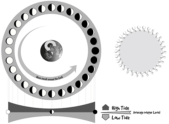
The phases of the Moon are connected to the tides. When the Moon is full or new, the tides vary the most from the average water level. When the Moon is half lit, the tides vary the least from the average.
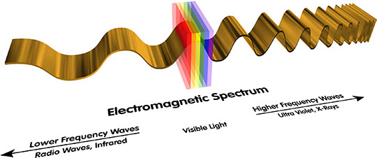
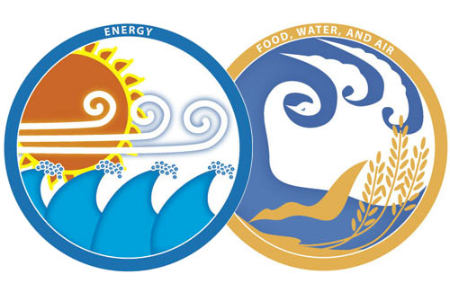
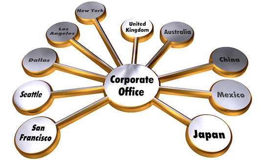
Often, to explain a technological innovation, it’s important to clearly depict a scientific principle (top and right). A presentation graphic displays branch office expansion (bottom).

10′ tall mural created for the Chabot Space and Science Center, Oakland, California.
Case Study: Resolution Simulator
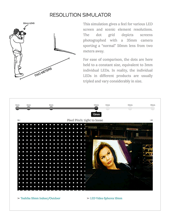
Interactive Resolution Simulator
Large Screen Video rented and sold giant video screens. They needed to meaningfully communicate their expertise about screen resolution with their customers. Resolution, measured as pixel pitch in millimeters, is an important measure of screen performance. But higher resolution isn’t necessarily better; an outdoor screen meant to be viewed in a stadium can benefit from a looser pitch by being brighter or cheaper. To a customer unfamiliar with these screens, the raw numbers—a 3mm pitch versus a 10mm pitch—doesn’t help much when choosing between them.
We designed an interactive information graphic to allow the user to simulate different resolutions. The graphic displays a standardized view of the pixel pitches to give meaning to the specification. It combines that with photographs of screens at each pitch and navigation to those screens. A selection bar snaps to discrete but not evenly spaced numerical intervals representing the available resolutions.
The graphic creatively distills the company’s expertise for their customers.
Case Study: Print Campaign

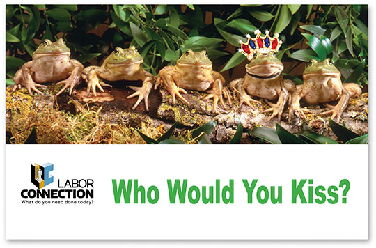
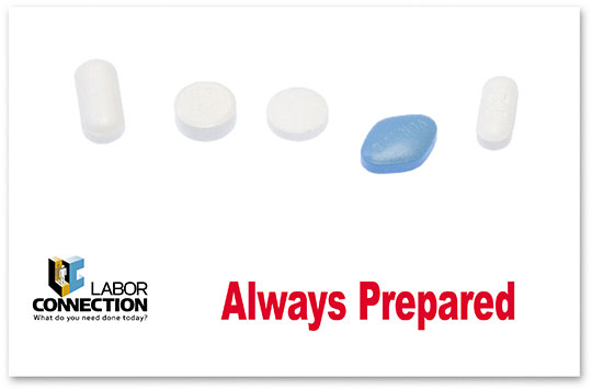
Labor Connection supplied temporary workers to the construction industry. For workers with special skills, they created a new “Select Worker” program. We created the slogan “Workers that Stand Out” and a supplementary logo mark. Then we created a campaign visually highlighting the fourth in a series of five, designed to be memorable to their audience of contractors. Here are a few of our favorites from the postcard campaign.
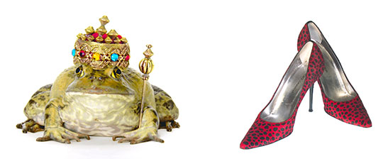
The frog images are by Kent Marshall. Pill and shoe images by Pipsqueak.

